Thursday 6 January 2011

Evaluation: Question 4


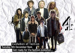
Adobe Photoshop was the program that we used to creatye our newspaper advertisement, we used the polygonal lasso tool to cut out each image that we had collected to create a collage effect for our poster and we also used the magic selection brush tool to help us do this. We used the rectangular marquee tool to help us to create the background for the title of our documentary and the channel etc in the style of channel 4.

Wednesday 5 January 2011

Evaluation: Question 3

Below is a video of one of the responses we recieved after presenting our documentary.


Below is a copy of the questionnaire that we handed out to the viewers of our doucmentary:

Circle the answer that yo find most appropriate:

1. On a scale of 1-5, how entertaining would you rate our documentary? (1=very entertaining, 5= not entertaining)

1 2 3 4 5


2. How eye-catching did you find our newspaper advertisement, on a scale of 1-5? (1= very interesting, 5= not interesting)

1 2 3 4 5


3. How much would you say our documentary compared to other professional documentaries? (1= compared well, 5= didnt compare at all)

1 2 3 4 5


4. What would you rate the technical quality used in our documentary? (eg sound, editing quality)(1= very good technical quality, 5= not good technical quality)

1 2 3 4 5


5. Did our radio advertisement make you want to watch the documentary? (1= yes, 5= no)


1 2 3 4 5


6. After watching the first five minutes of our documentary, did you want to continue and watch the full 30 minute program? (1= yes, 5= no)


1 2 3 4 5


7. How much would you say that our documentary was appropriate for channel 4 and compares to other channel 4 documentaries? (1= very appropriate, 5=not appropriate)

1 2 3 4 5

8. Would you say that our radio advert and newspaper advert were informative of our documentary? (1= very informative, 5= not informative)

1 2 3 4 5


9. Would you say that the cutaways we used through our documentary were relevant and appropriate? (1= very relevant, 5= not relevant)

1 2 3 4 5


10. On a scale of 1-5, how appropriate was the voiceover that was used in the radio advert and documentary? ( 1- very appropriate, 5= not appropriate)

1 2 3 4 5


11. How would you rate the music choice seen in the documentary and radio advert? (1= good music choice, 5= bad music choices)


1 2 3 4 5

Below is a graph showing the results that we collected from the 15 people that filled in our questionairre. From these results we concluded that overall our documentary was thought to be a success by the viewers and that it was persuasive and infromative for them. The weakest parts of our documentary that have been higlighted from the results of the questionnaires would be the persuasiveness of the radio advert on the reader, and also the effectiveness of the voiceover alltogether. I think that the voiceover was one of the weakest elements of our documentary and radio advert and would be one thing we would change if we were to do this again. We would have changed the voice used to be better suited to the theme of the documentary and to draw more attention during the radio advert etc. The most positive thing we recieved through the questionairre was about our choice of music for the radio advert and the documentary, we feel that we did make a good choice with our choice of music and that it presented the tone of our docuementary perfectly and also the beats of the music fitted well with the photoshoot at the beggining of the documentary making it look more professional.


Below are some other comments we recieved on our documentary from the viewers who filled out the questionairre:

"I thought that the print advert looked really interesting and made me want to watch the documentary. I also thought the documentary itself was informative about fashions from the past and I also really liked the music in the documentary."


"The radio advert was good because the music attracted peoples attention straight away and made me want to watch the documentary. I would have liked to watch the whole 30 minutes of the documentary."

"I liked that the real channel 4 logo was used on the poster because it made it look really real and the writing that was on the poster looked like a real channel 4 advert. I liked the documentary because it was fun and exciting and i learned about fashion from the past and where it came from."

"I didnt know much about fashion from the past before watching the documentary but even after the first 5 minutes i learned a lot and would have definitley watched the whole 30 minutes."

Sunday 2 January 2011

Evaluation: Question 1

1. In what ways does your media product use, develop or challenge forms and conventions of real media products?


The two screengrabs from the professional documentaries, the one above from the documentary 'Food inc.', and the one below,also taken from the documentary 'Food inc' both follow the typical codes and conventions for documentaries as does our documentary in the two screenshots below. In the documentary above, the mise en scene is relvevant to the topic and compliments what is being said. This can also be seen in the screengrab from the interview with Sue Kendrick in our documentary, where lost of items of clothing from the shop have been displayed on the walls, along with mannequins and many other fashion based items.


Another thing that can be seen in all four screen grabs, in terms of structure, is the rule of thirds, and also that the head of the interviewee is either to the left or right, commonly to the right as in these three documentary interviews. The interveiwee in the professional documentarys and also in our documentary is looking at the interviewer, another typical element of a documentary interview. One interviewee is interviewed at a time aswel, and we have also followed this convention. Both professional documentarys and also our documentary all consult experts on their topic, this can be seen in our documentary, with Sue Kendrick being interviewed in the screen grab, and also in the documentary above, the farmer is being interviewed.


The video below is a perfect example of how the interviewee typically looks at the interviewee and not the camera when they are talking, and how graphics are typically always used at every interview to introduce the interviewee to the viewer.


Newspaper Advertisement


The newspaper advert that we created is similar to the stereotypical channel 4 still adverts and follows the conventions of those. We tried to make our advert innovative and individual, as the other channel 4 adverts are, and to make it stand out from the crowd. We see channel 4 as being loud, and unusual, and we wanted to majorly incorporate this into our own advert. We chose the colour of the channel 4 sign and the background of the title to be black and white as the photos on the background were in colour and we wanted to make the sign stand out against the white background, and also to add an element of seriousness infront of the scrapbook style background.


Our newspaper advert has been annotated, labelling the similarities between our advert and a typical channel 4 advert.


Radio Advert:
Below is a screen shot of the timeline of our radio advert oin Adobe Premier,


There are also codes and conventions for a radio advert, as the print advert is designed to catch the eyes, the radio advert is designed to catch the ears, and there are certain codes and conventions that a typical radio advert should follow:

  • The channel that the programme is being displayed on
  • The time and day that the programme will be aired
  • Sound clips taken from the program, designed to intrigue the reader/listener
  • A voiceover
  • The radio advert should give a true insight as to what the program is about
  • Music is usually involved in the advert to help to set the tone for what the documentary is about

Tuesday 14 December 2010

Audience Feedback

This is the questionnaire that we gave to the audience after watching our documentary, we chose these questions as we thought they would get a good range of feedback from the audience.

Circle the answer that yo find most appropriate:

1. On a scale of 1-5, how entertaining would you rate our documentary? (1=very entertaining, 5= not entertaining)

1 2 3 4 5


2. How eye-catching did you find our newspaper advertisement, on a scale of 1-5? (1= very interesting, 5= not interesting)

1 2 3 4 5


3. How much would you say our documentary compared to other professional documentaries? (1= compared well, 5= didnt compare at all)

1 2 3 4 5


4. What would you rate the technical quality used in our documentary? (eg sound, editing quality)(1= very good technical quality, 5= not good technical quality)

1 2 3 4 5


5. Did our radio advertisement make you want to watch the documentary? (1= yes, 5= no)


1 2 3 4 5


6. After watching the first five minutes of our documentary, did you want to continue and watch the full 30 minute program? (1= yes, 5= no)


1 2 3 4 5


7. How much would you say that our documentary was appropriate for channel 4 and compares to other channel 4 documentaries? (1= very appropriate, 5=not appropriate)

1 2 3 4 5

8. Would you say that our radio advert and newspaper advert were informative of our documentary? (1= very informative, 5= not informative)

1 2 3 4 5


9. Would you say that the cutaways we used through our documentary were relevant and appropriate? (1= very relevant, 5= not relevant)

1 2 3 4 5


10. On a scale of 1-5, how appropriate was the voiceover that was used in the radio advert and documentary? ( 1- very appropriate, 5= not appropriate)

1 2 3 4 5


11. How would you rate the music choice seen in the documentary and radio advert? (1= good music choice, 5= bad music choices)


1 2 3 4 5

Monday 13 December 2010

Print Advert, Finished Documentary and Radio ad


Research: Channel 4

We have chosen Channel 4 as the channel to display our documentary. The newspaper adverts typically displayed from channel 4 are witty and are also usually just one still image paired with a headline. We have researched still adverts from Channel 4 from the past and we think that we the style that channel 4 use for their adverts would perfectly suit the style of our documentary.


Above is a copy of our newspaper advert for the documentary .We used photoshop to produce this work and place the advert together. We used images that we had taken of students around college that were wearing outfits that we felt reflected a certain era or style, we took many photos and then on photoshop edited them together, cutting around the sillhouettes in a scrapbook type way. We have tried to reflect the individuality and fun nature of our documentary in this advert and we believe that this has been achieved. We are aiming for the different images and styles used in the advert to catch the audiences attention straight away.

Even though we werent producing a television advert we researched the television adverts of the past from channel 4, as this could inspire us for the radio advert and the newspaper advert and help to give us more of an idea of what channel 4 is about, and the style that they are known for using in their advertisements. The adverts from channel 4 are very often witty, have their own style and are ironice in a humourous way. Below are three videos of channel 4 tv adverts that I particularly felt summed up the style and tone of channel 4's adverts.


We also decided to research other radio adverts, to inspire us for our own advert and also to give us a clearer idea as to the common techniques used by professional companies.